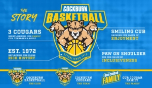
After a month long launch campaign online, the Cockburn Basketball Association officially unveiled it’s new look for 2021 this morning.
It has been nearly two decades since the Association updated it’s brand and logo, with a bold and unique design spearheading the new look.
The Association has creatively brought together both the Cockburn Basketball Association (the club) and Cockburn Cougar brands (the team) together under the same design, keeping true to it’s family heritage, rich history and key values.

Cockburn Basketball Association Chief Executive Tyrone Thwaites said the brand was important to the Cougar community, with the logo needing to be representative of what the community stands for.
“It was really critical for us to make sure our new face represented our direction as a club, the feel of the community, and reflect our history all at the same time,” Thwaites said.
“Blue and gold must be front and centre, it needed to feel like family, and our values had to be embedded in the imagery.
“There’s a perfect balance of those elements in the new design, and with the three Cougars it represents a very unique look in the WA basketball landscape.
“A young cub, teenager and adult all in the one logo is very Cockburn.
“It has been well received by our Cougar Family and has added to the buzz to kick off the new year.”
Alongside the launch of a new logo, the Association has updated merchandise and launched ‘One Family’ as the official campaign for the inaugural NBL1 season.
“Coinciding a brand launch and the first ever NBL1 West season was a deliberate choice.
“The biggest change to our State League in 30 years was the perfect platform to launch a new era for Cockburn Basketball.
“Our community is constantly evolving and changing, and with so many new faces joining the family in the past few years, it’s important the brand keeps up with the growth of our community.
“We are really excited for what this represents for our proud Cougar Family and our extended community.”
